Docs

To enter the B2B market, Stytch– an authentication platform for developers– bifurcated its products and content across various surface areas.
I improved the developer documentation (Docs) so developers can navigate through these new changes.
Role
Product designer
UX researcher
Contributions
UX design
UI design
Visual design
Research & usability testing
Collaborators
Technical content manger
Engineers
Duration
8 weeks
Background
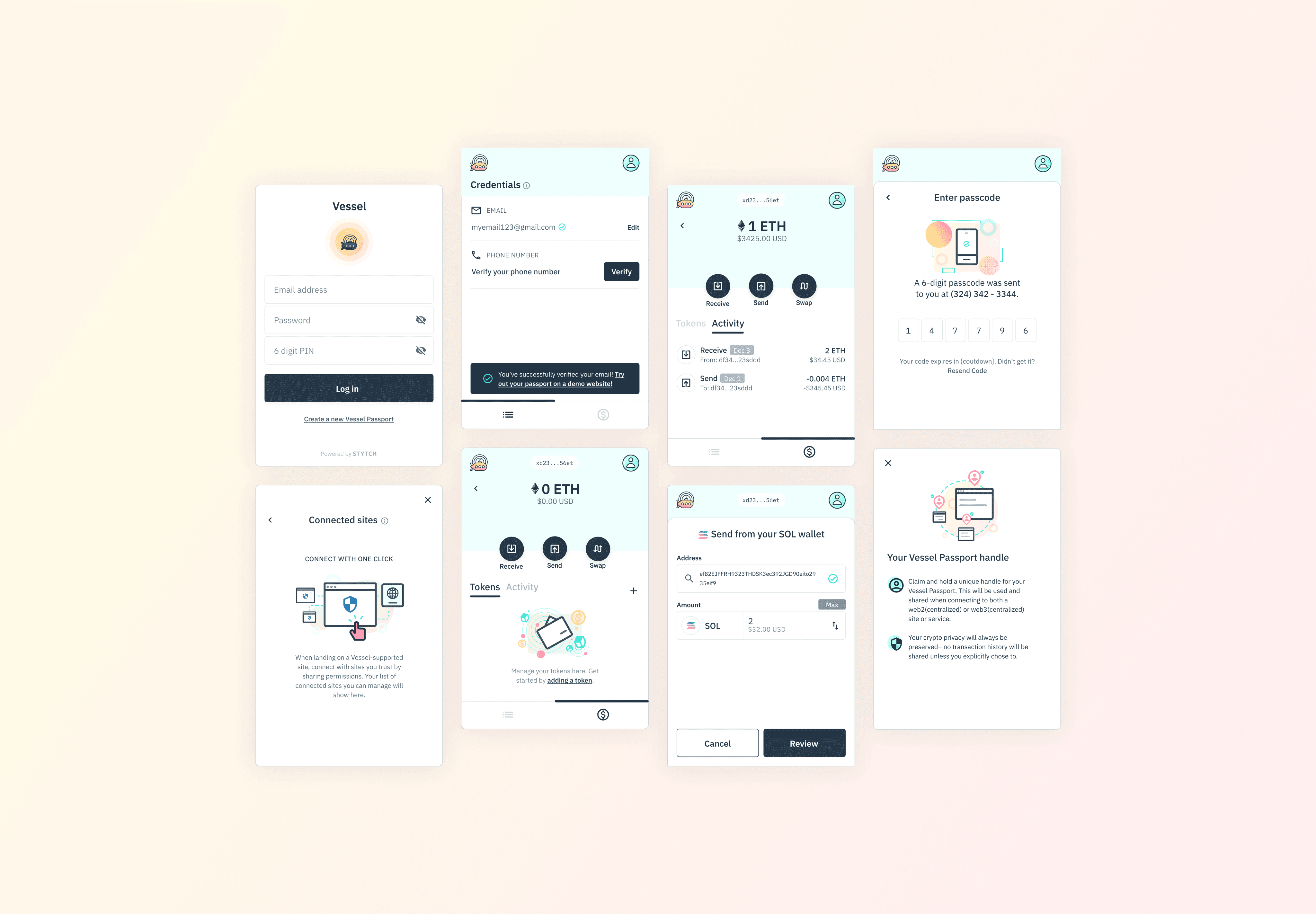
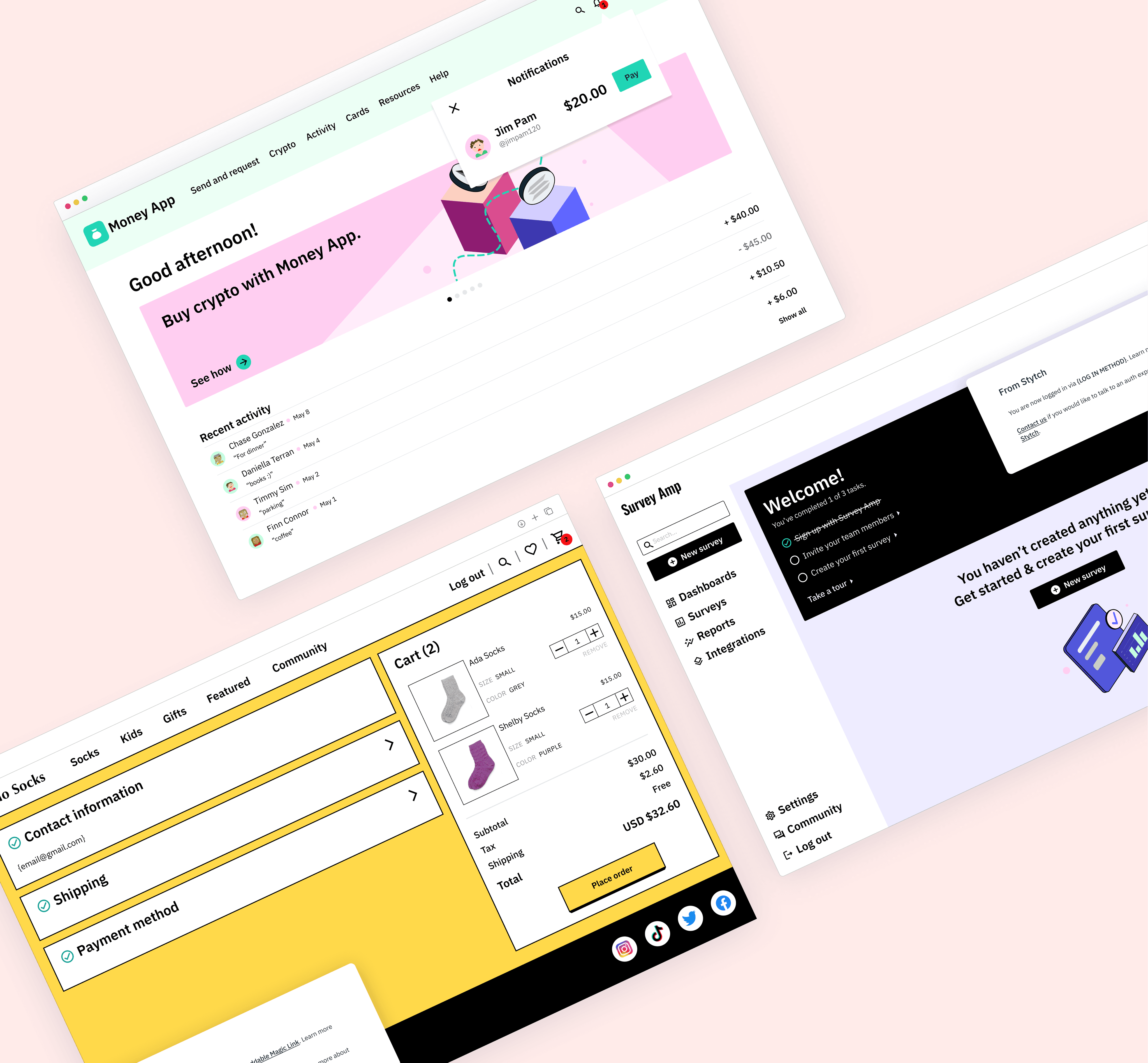
Stytch, an authentication (auth) platform geared for consumer-based companies, decided to expand its product offerings to B2B companies.
B2B auth differs from consumer auth, requiring changes across various surface areas, including developer documentation (Docs).
Problem
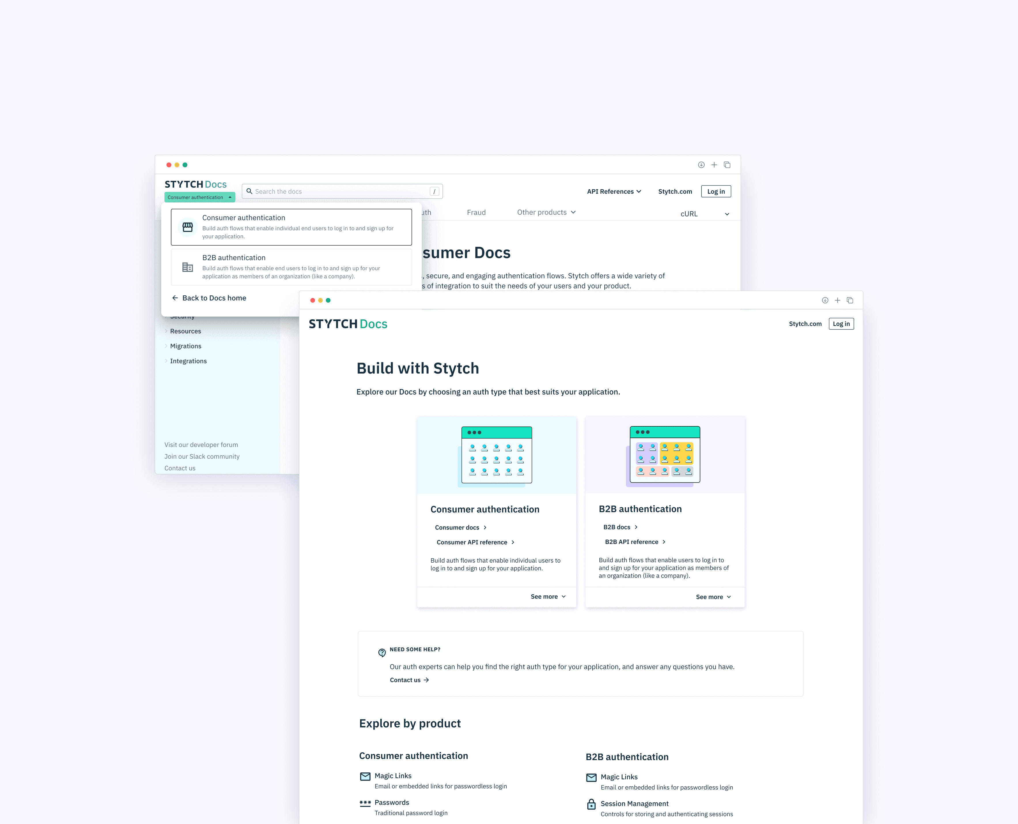
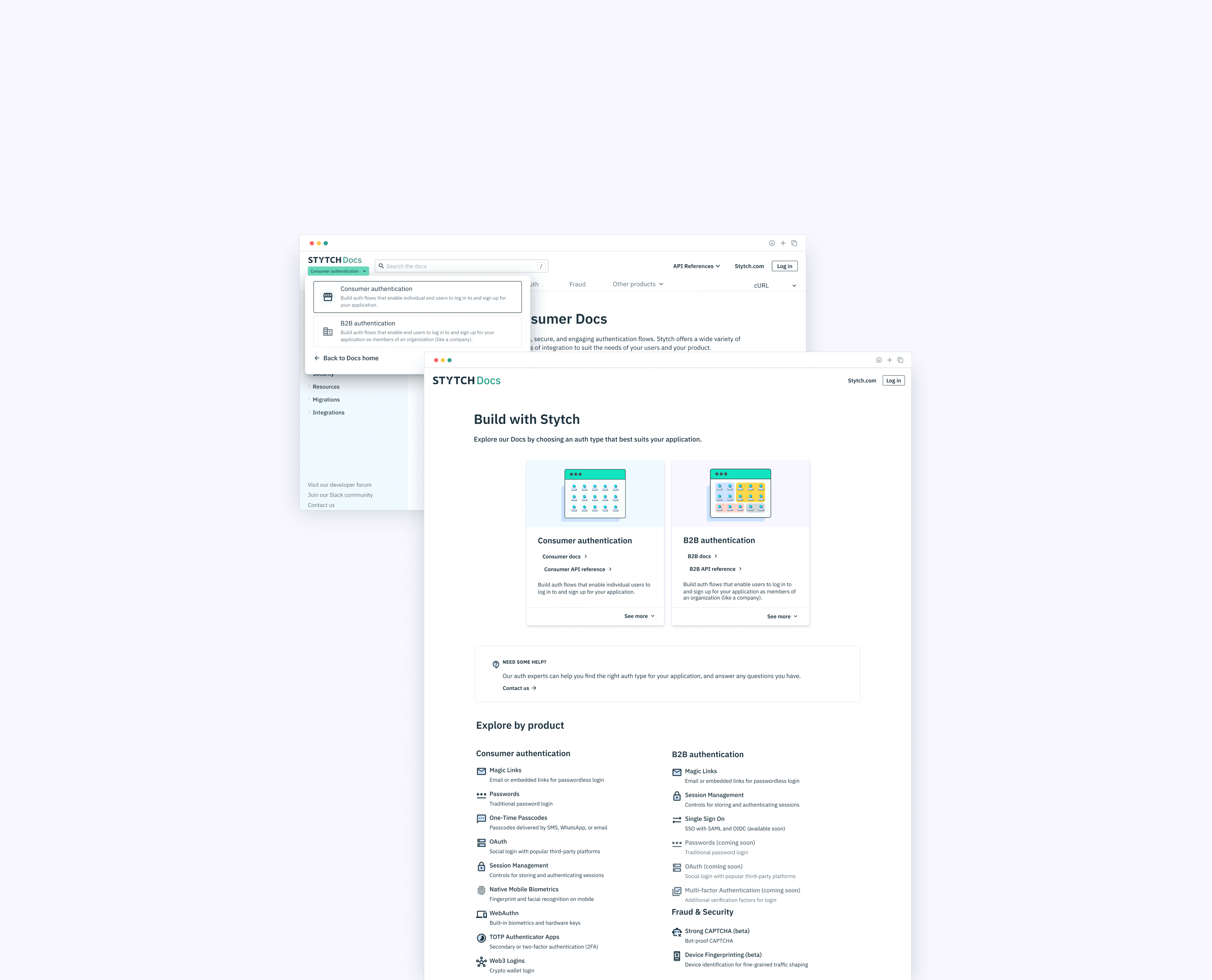
The team decided to bifurcate content– separating consumer and B2B auth– across all Stytch surface areas.
What's the impact of bifurcation? How might we modify Docs to support another authentication type?
Goals
Help users quickly discern if their project applies to the consumer auth type or B2B auth type
Provide a way for users to navigate to and between consumer and B2B documentation
DEFINE
Auditing
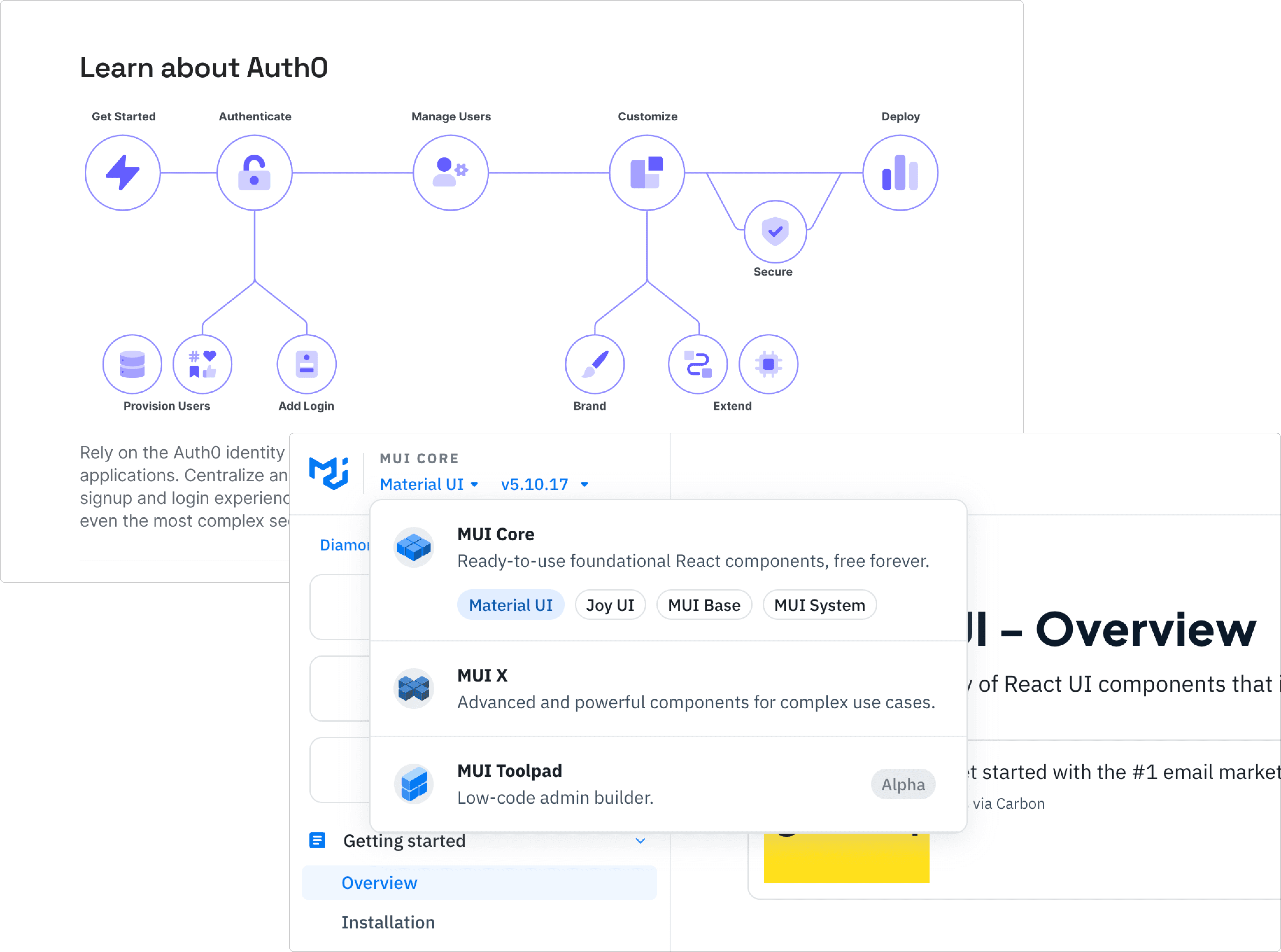
How do auth companies approach content reorganization?
Competitor audits revealed little to no hierarchy and organizational patterns unique to the auth space. While technical terminology remained consistent, each company did have a distinct marketing approach for how they framed auth to users.
How might bifurcation fit into Stytch's current architecture?
With no significant industry standard on auth content hierarchy and organization, the team ideated on low lift UX solutions for the Stytch dashboard first.
In relation to the dashboard's new structure, we then landed on an organizational model for Docs that fit within the context of Stytch.
DEFINE
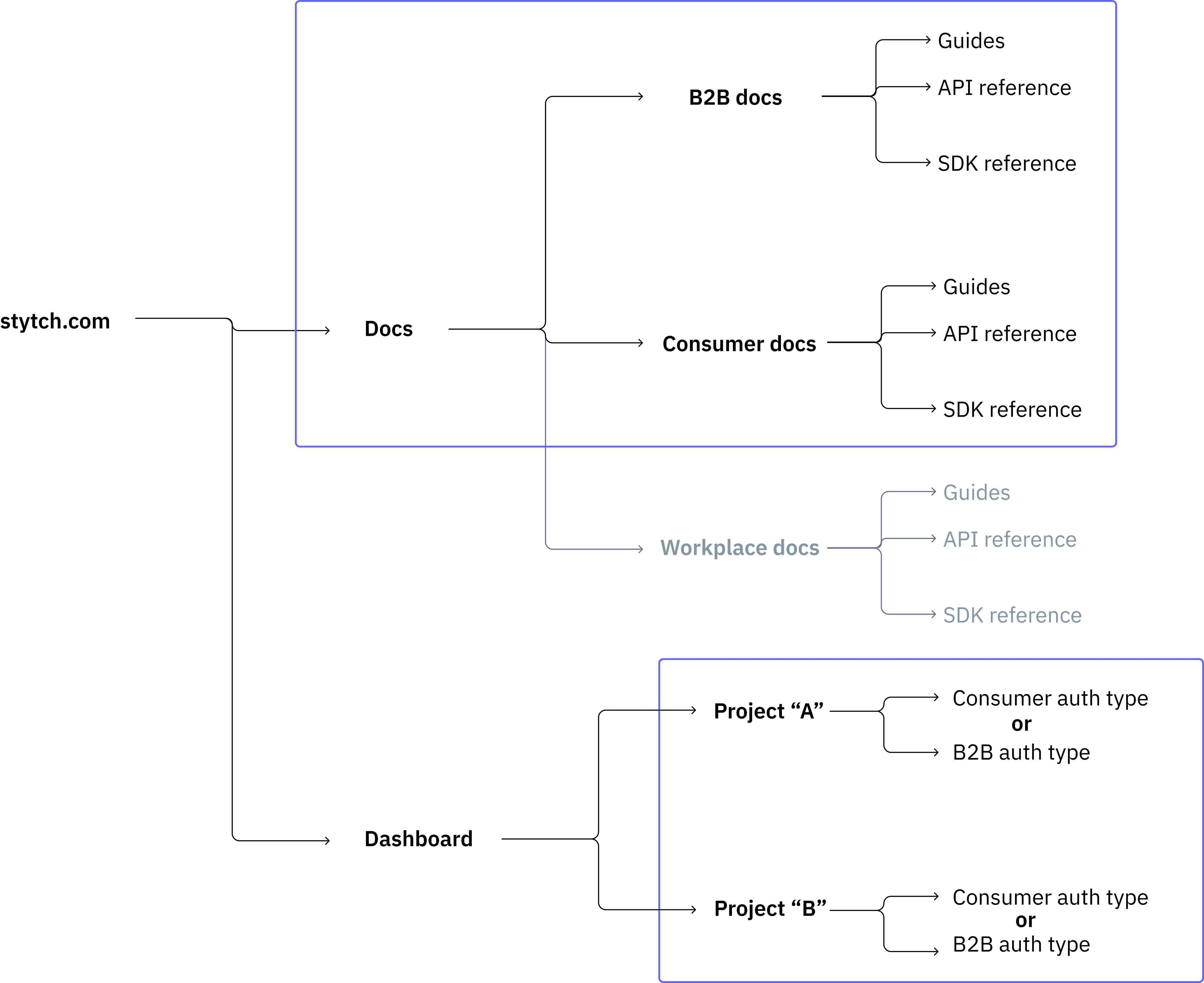
User mapping
To help align cross-functional partners on the proposed solution and its ripple affect, I created a few user maps to help visualize where inconsistencies and user knowledge gaps might lie.
DESIGN
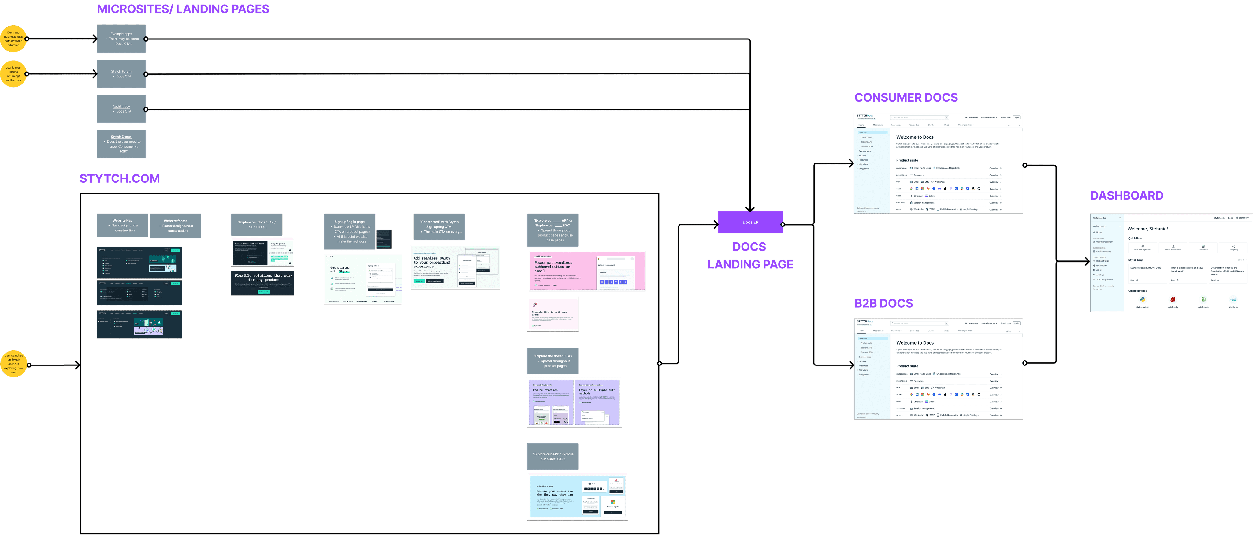
Wireframing
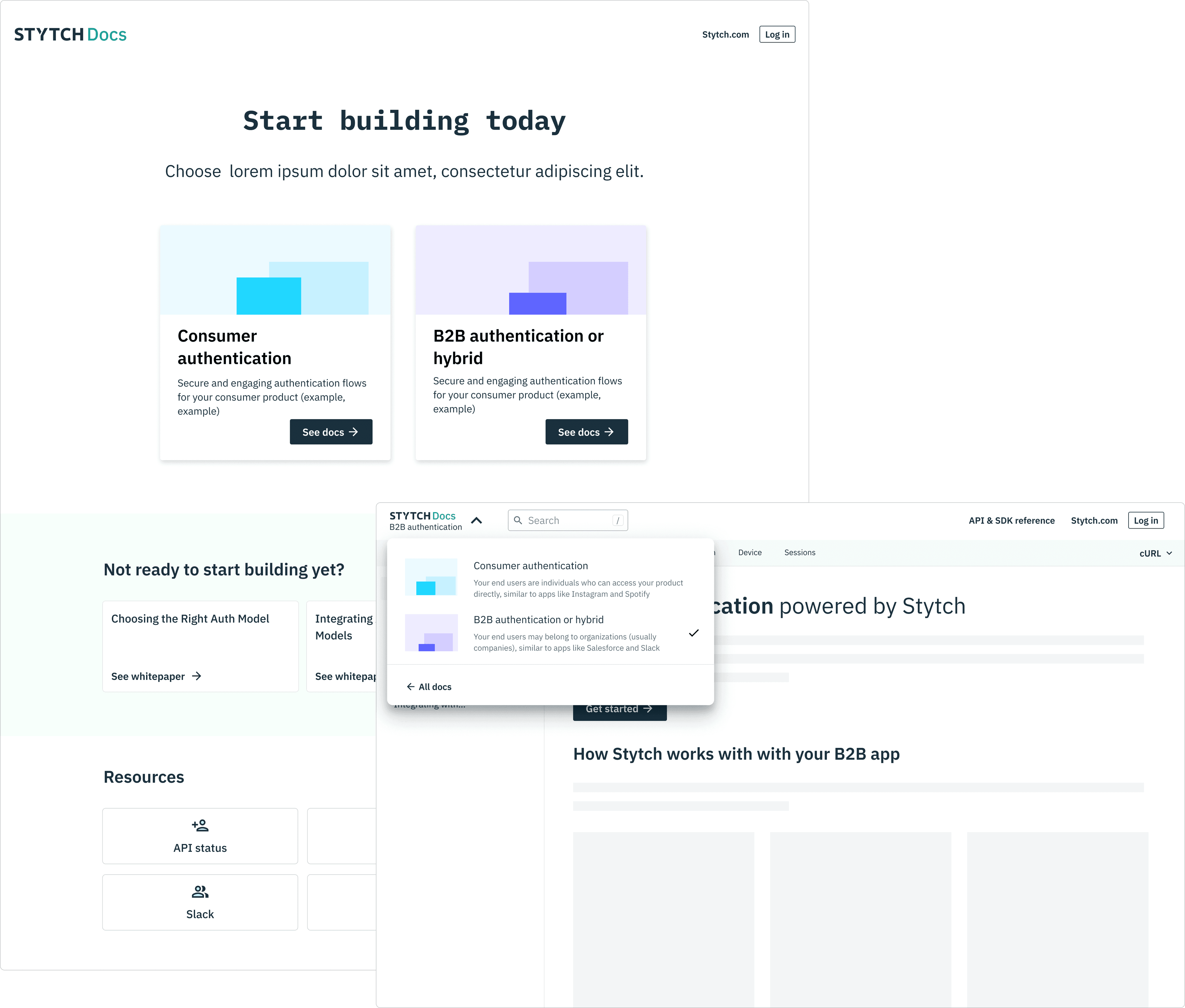
While addressing smaller inconsistencies in the user journey, I began iterating on low to mid fidelity designs for high touchpoint CTAs and pages, including the landing page and home pages for both consumer auth and B2B auth.

DESIGN
Visual design
Current information architecture prevented me from creating a home page that was visually cohesive to the rest of Docs– it would yield a scope larger than intended. Due to this blocker, I decided to create a low lift visual design that blended the the current Docs, Dashboard, and stytch.com styles together.
DESIGN
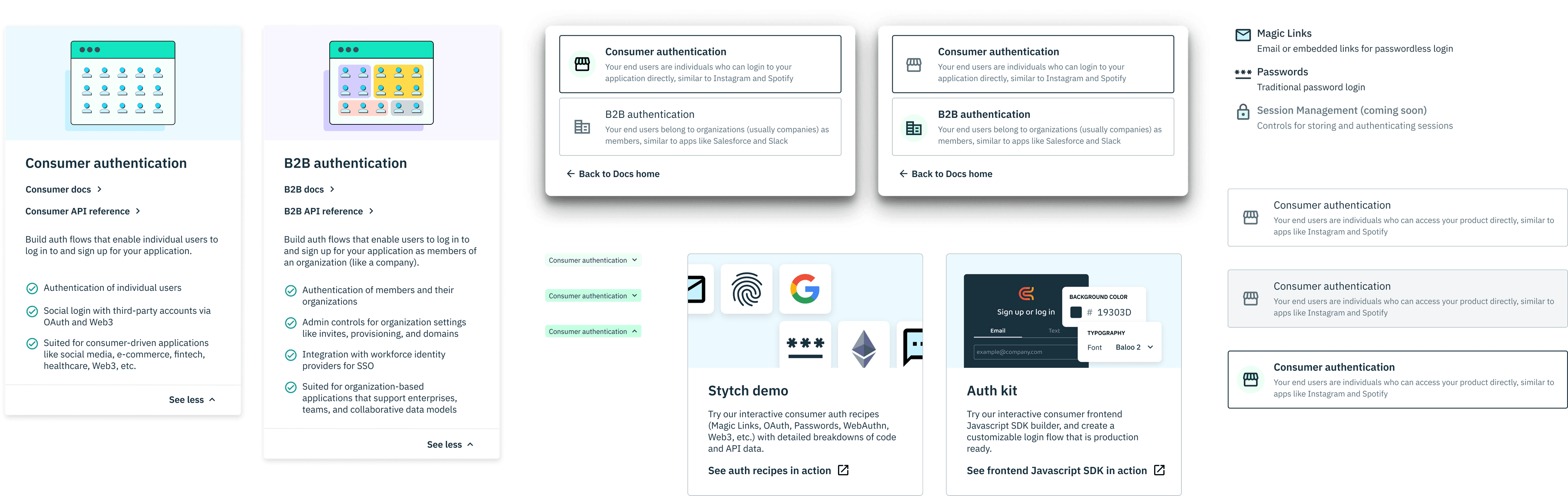
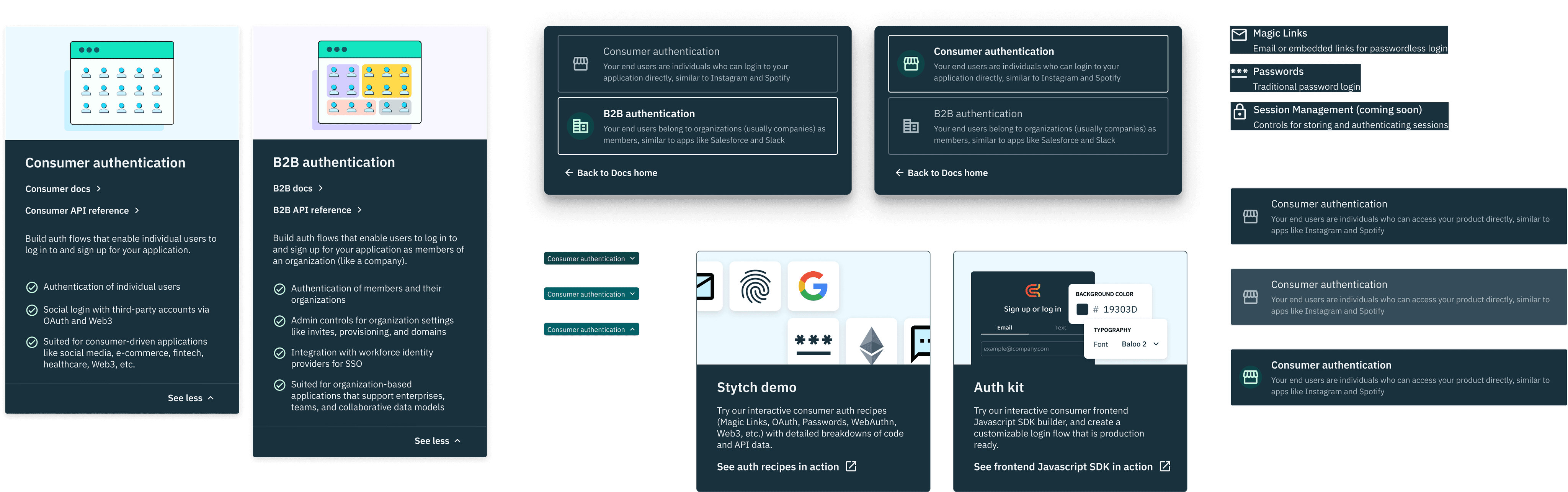
High fidelity
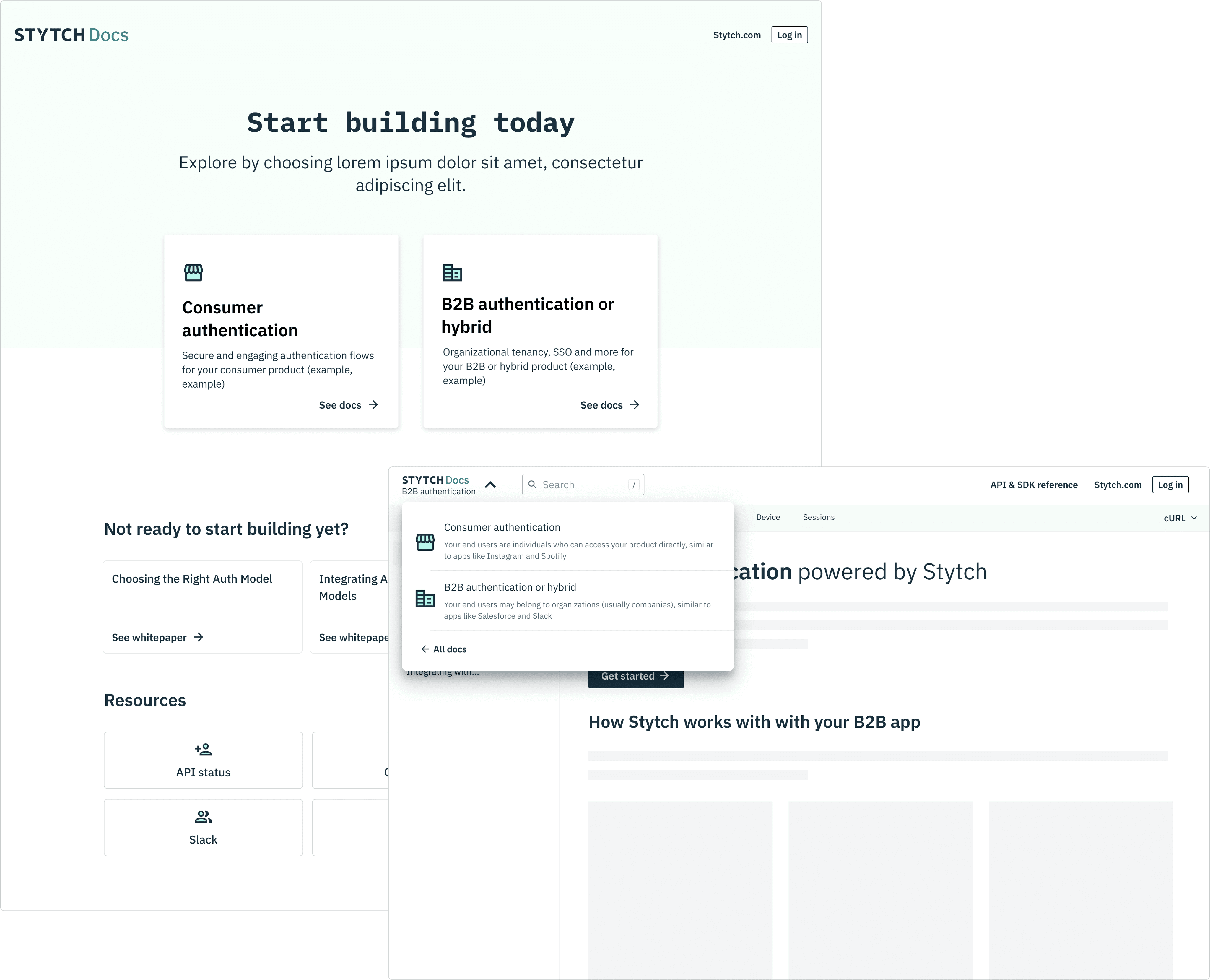
After iterations on the design and copy with the technical content lead, I supplemented with prototypes when necessary in order to illustrate interactive design details.
Docs home page

Docs navigation

ITERATION
Research
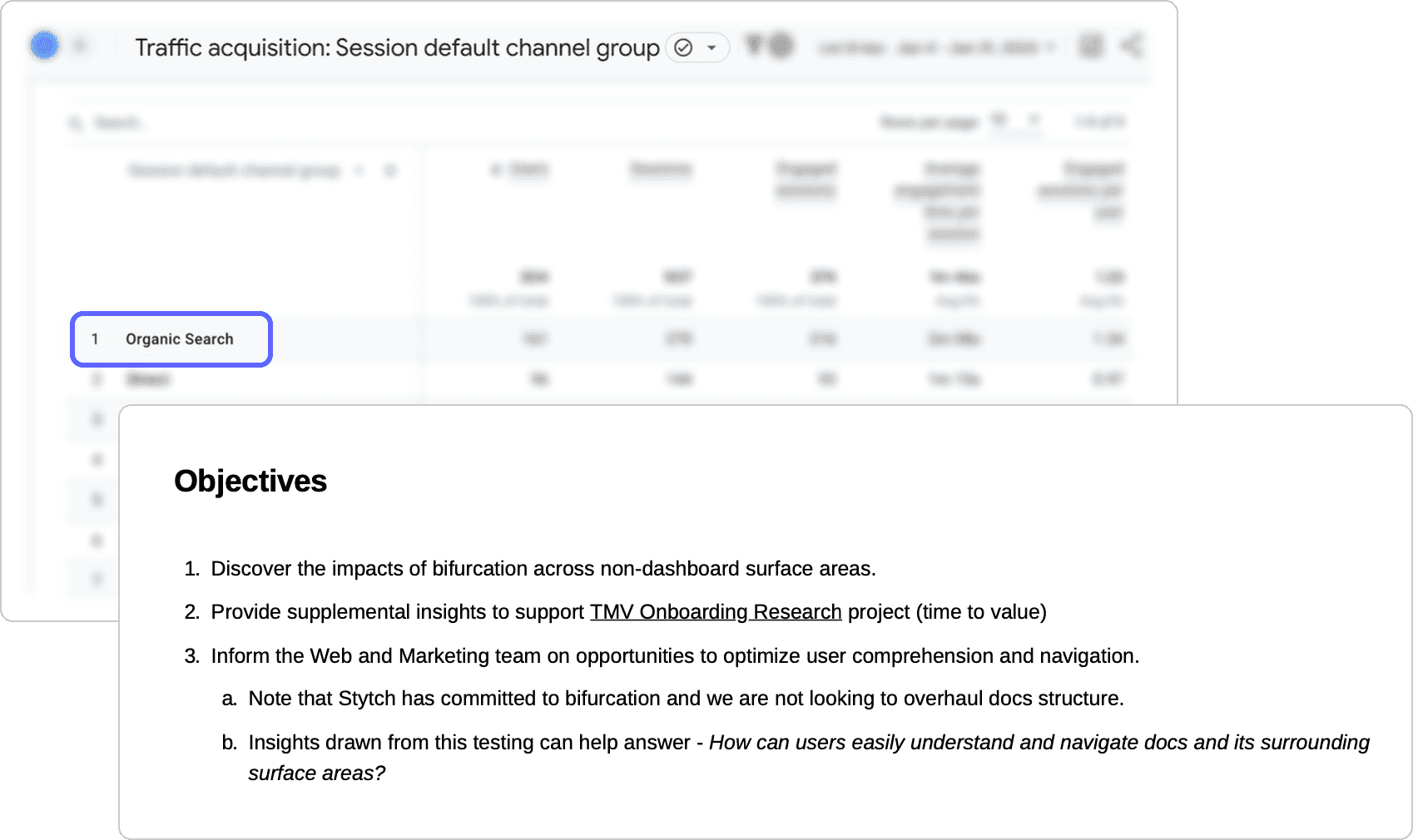
Because bifurcation had such a large impact cross-functionally, it was important to measure the effectiveness and impact of the designs.
While shipping the new designs, I consulted with our UX researcher to build and execute a testing plan and process.
Strategy and planning
I looked to previous data points and voiced concerns on both the product and go-to-market teams to develop and define the goals, objectives, and test participant type.

Scripting and interviewing
After strategizing, I formulated user scenarios corresponding to the test plan, followed by specific scripting and questions.
Through 5 usability tests from participants qualified through Respondent, we were able to determine a few patterns to help Docs move forward.
CONCLUSION
Impact
The Docs home page remains a hub for users, particularly developers, with continuous additions of new developer resources on this page.
Learnings
Executing on a design project and influencing stakeholders through design can be distinct skills. As a newcomer to Docs, presenting new strategies to secure resources for north star designs proved challenging.
Shared language is crucial, particularly in a Saas environment where technical or newly created terms are common. I found it valuable to collaboratively define new terminology on paper early on, even if terms or concepts are not set in stone.
Bifurcation impacted many teams; it was important to emphasize visual communication through materials like maps and annotations in order for others to quickly interpret context and uncover gaps.
Explore other case studies