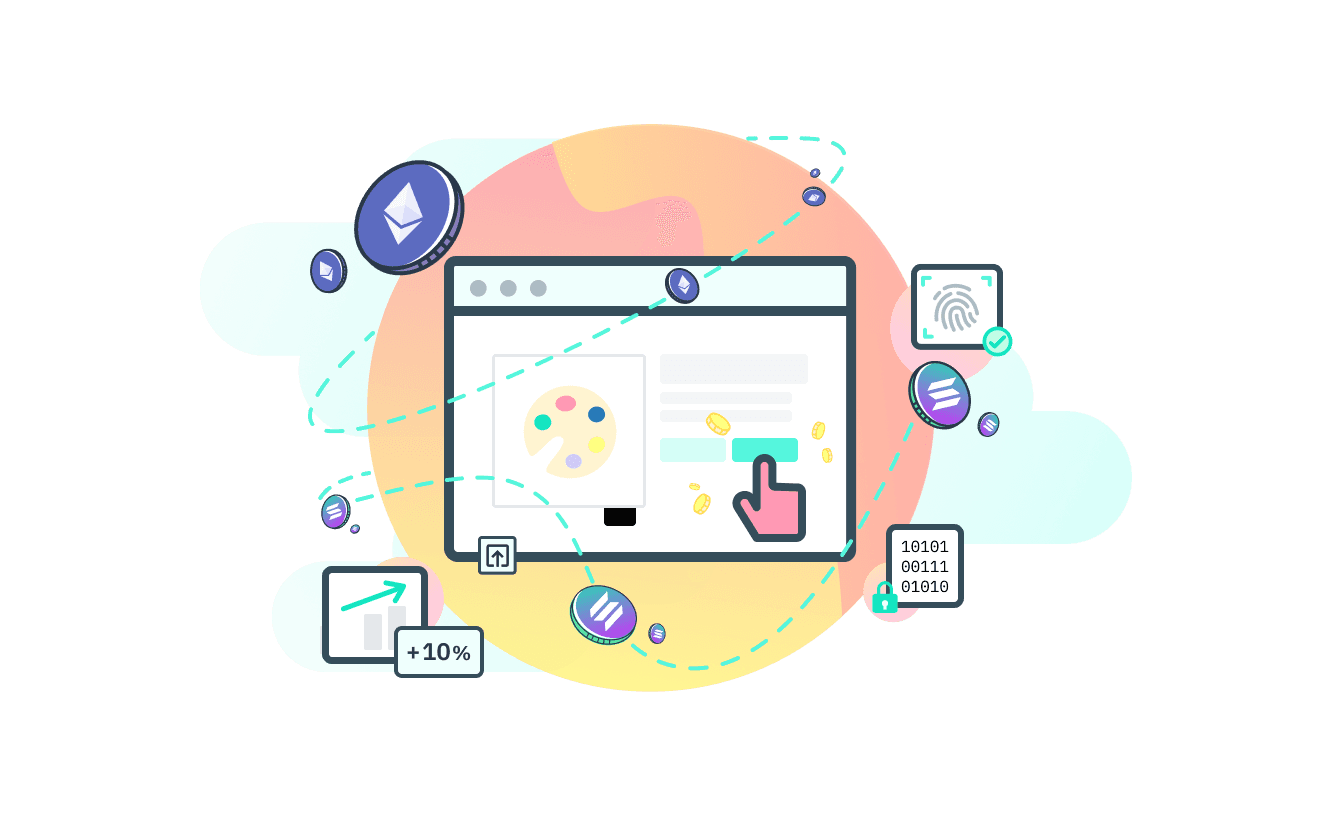
Vessel

Stytch, an authentication platform for developers, intends to ship a new consumer-facing product in the web3 space.
I designed a hybrid web2 and web3 browser extension, reimagining identity and authentication to eliminate friction on the modern web.
Role
Product designer
Contributions
UX design
UI design
Visual design
Illustration
Prototyping
Usability testing
Collaborators
UX researcher
Brand designer
Back-end/blockchain engineer
Front-end engineers
Duration
11 weeks
Background
Stytch is an authentication (auth) platform for developers.
They are looking to ship and test out their first consumer-facing product, challenging what digital identity and auth looks like in the world of web3.
Problem
Both web2 and web3 users experience frustrations in user authentication. In web2, users are constantly creating new login accounts and resetting their passwords, while web3 users deal with private keys and seed phrases.
How might users in both spaces authenticate and navigate the web with reduced friction?
Goals
Design a chrome browser extension which allows users to:
Authenticate securely and efficiently with both web2 and web3 websites and applications
Safely execute on essential cryptocurrency transactions that are fundamental to the web3 ecosystem
RESEARCH
Secondary research
What does the web3 space look like? What successful products exist?
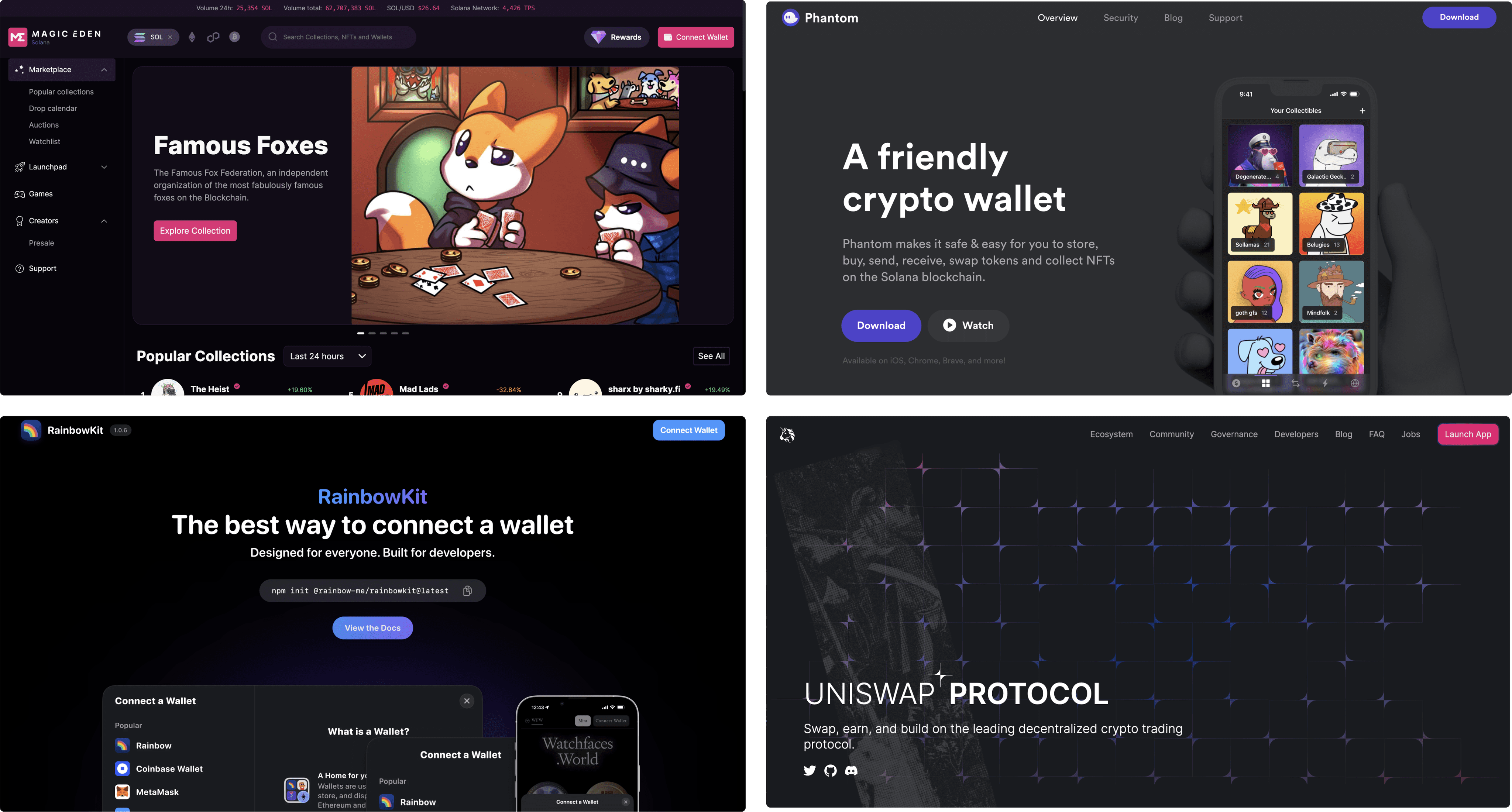
Product audits and competitive research indicated that the web3 space is still very much a developer-centric wild west; its rise to popularity is mostly garnered by digital art trading.
From complex technical jargon, to the prevalent dark mode usage, to the overall cyberpunk or futuristic aesthetic, web3 continues to change rapidly.
What does auth look like in web3?
Instead of the typical password or social media login, web3 necessitates users to possess and authenticate via a digital wallet.
The wallet serves as a identity on the web, and users face a distinct set of authentication challenges compared to web2, such as recalling seed phrases and private keys.
How should we be thinking about users for this novel product?
Web3 has a less than ideal user experience and a ton of technical terms and processes.
Through research, I learned that it was difficult to determine our target user persona early on. Should the team prioritize existing web3 users, or focus on new and web3 curious users?

DEFINE
Information architecture
Following a research sprint, I brainstormed some frameworks on how potential users types should be thinking about Vessel, then ideated on some potential key features and optimal user flows to align on what a MVP could look like.
DESIGN
Wireframing
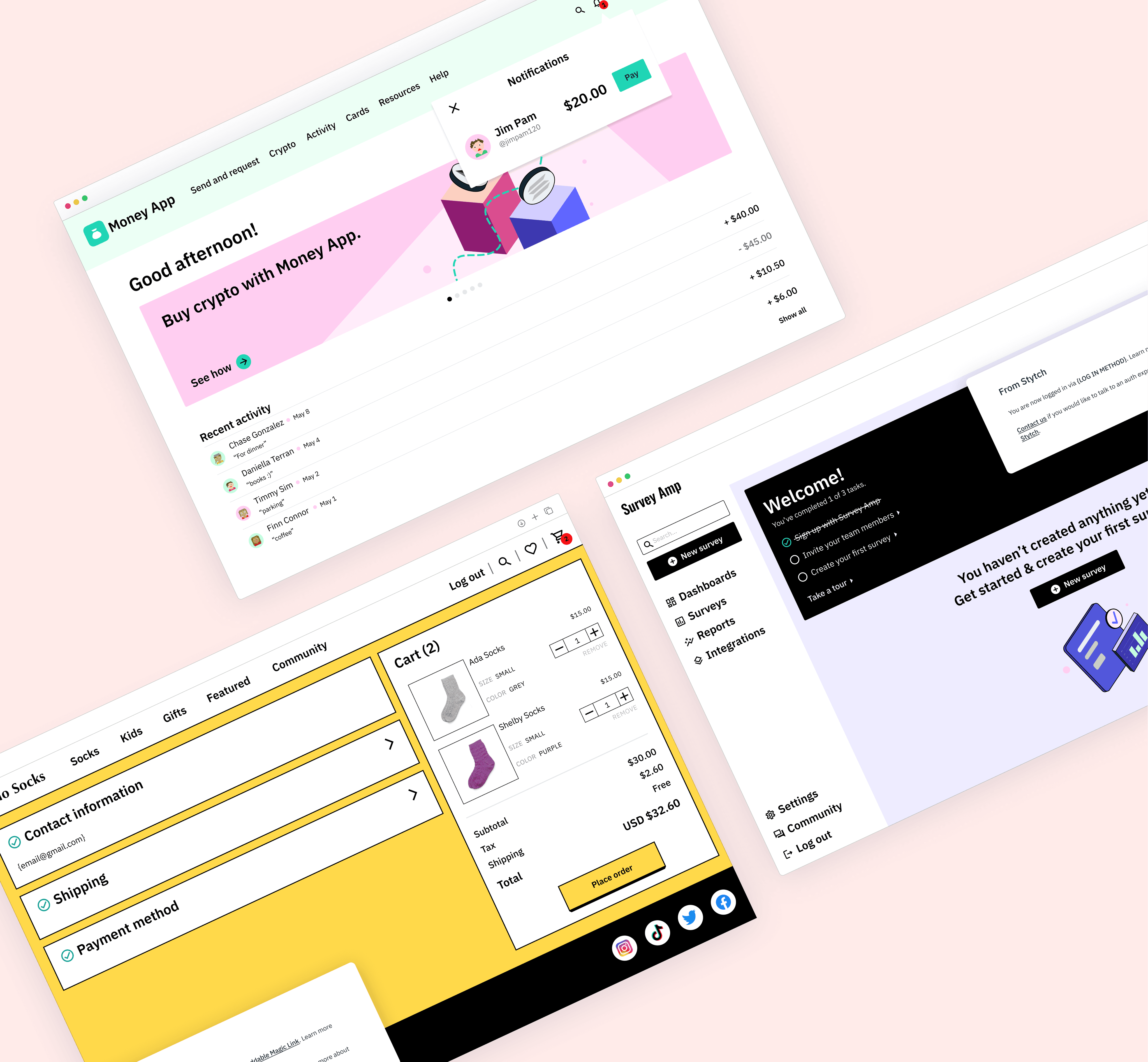
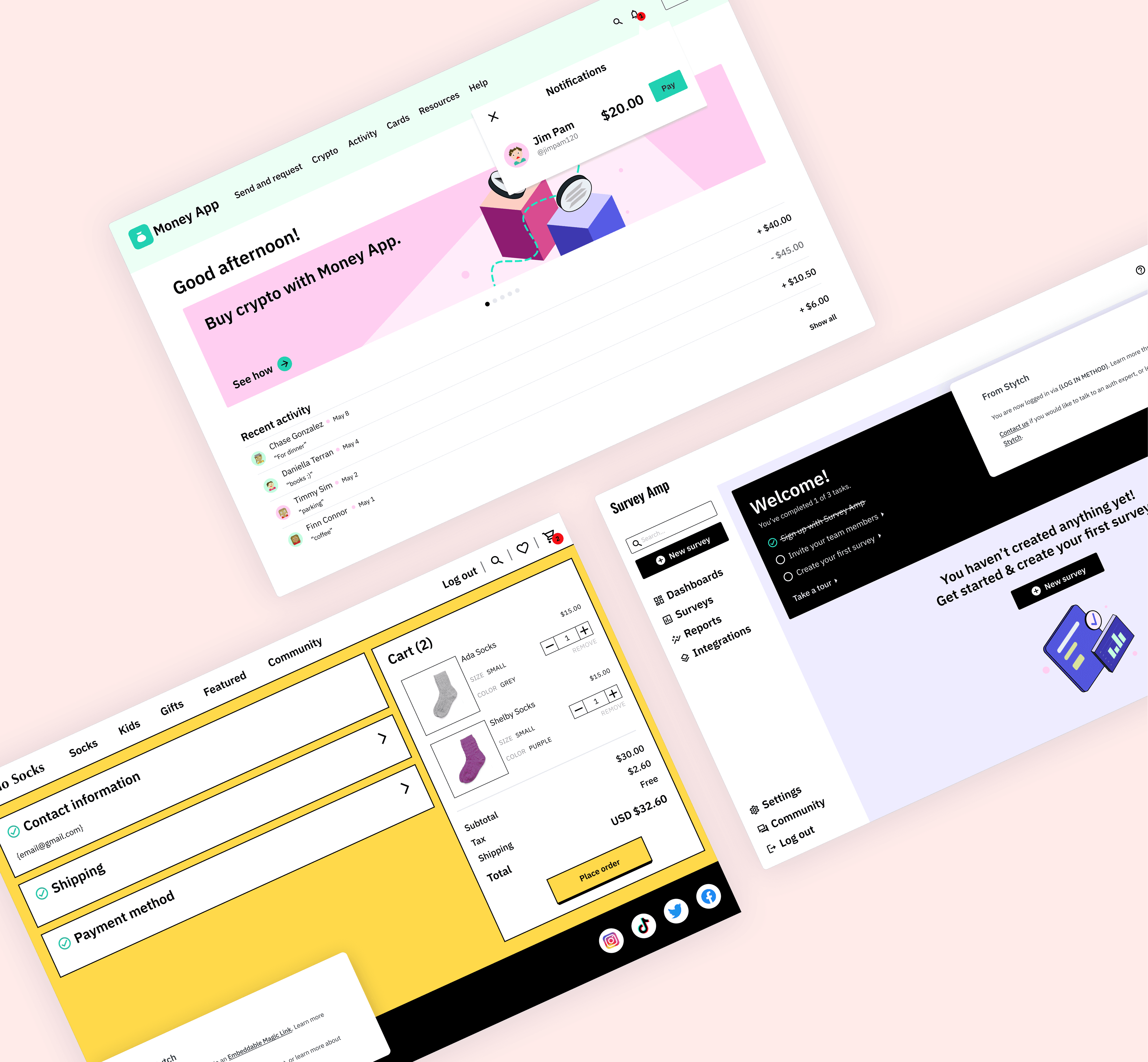
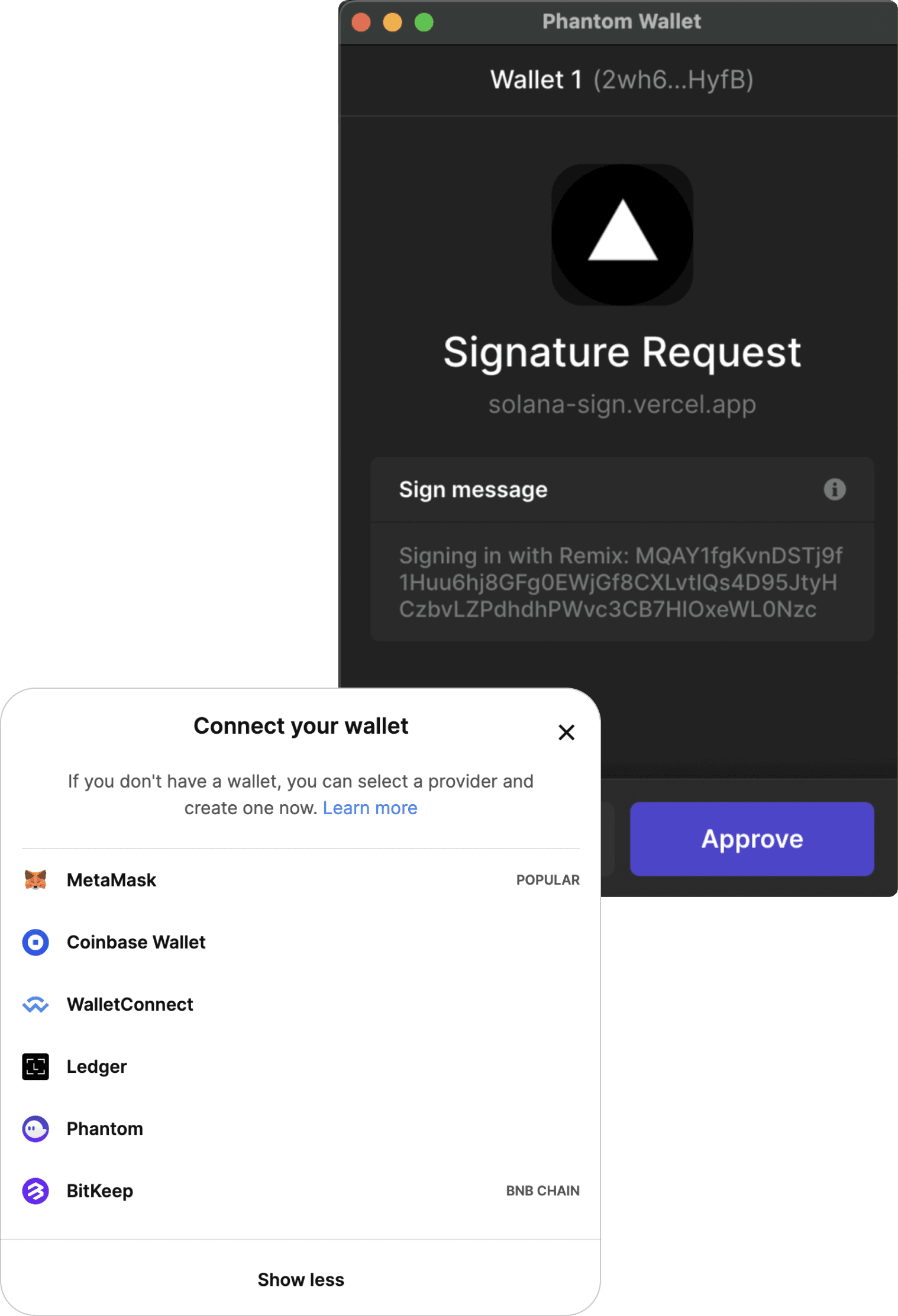
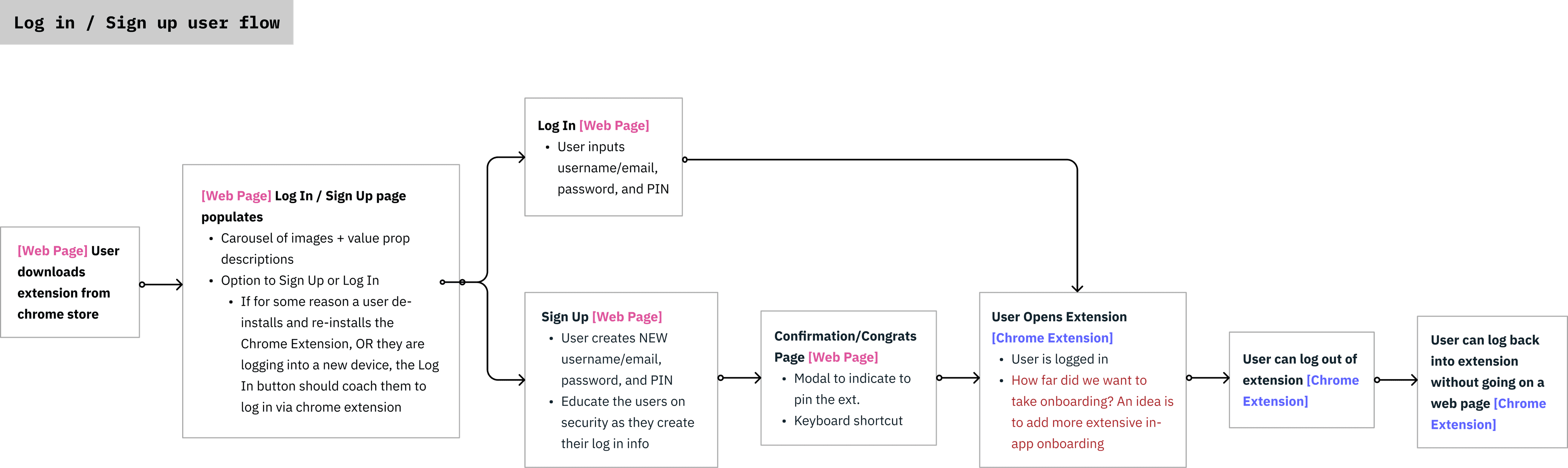
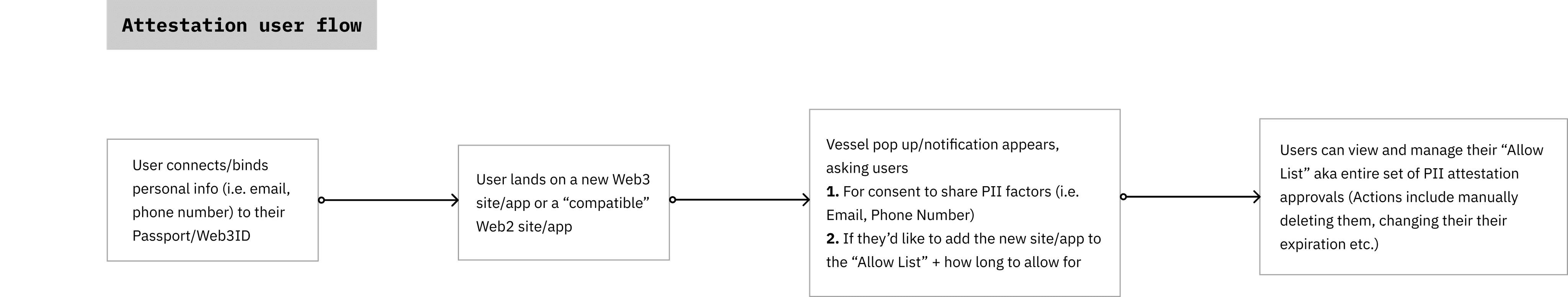
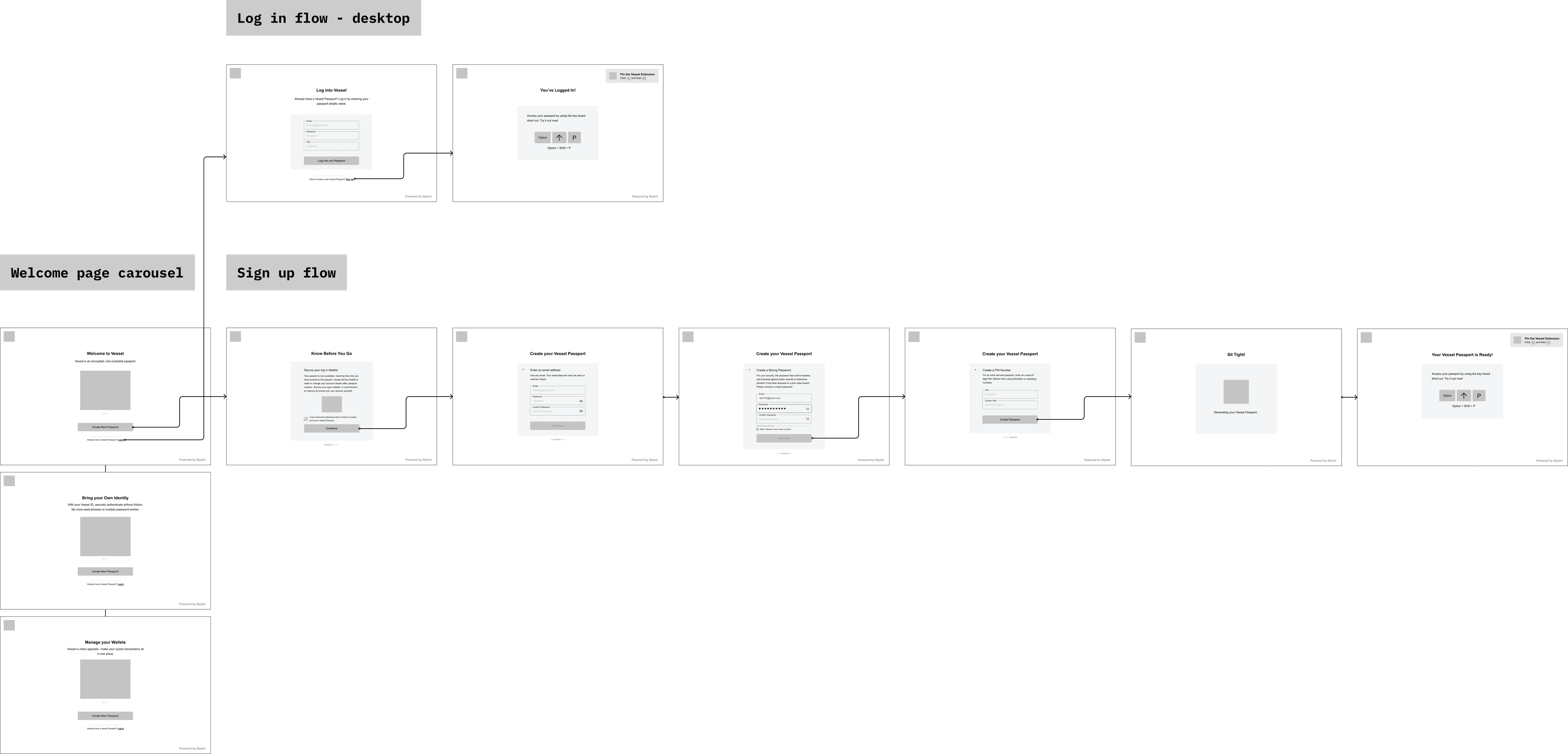
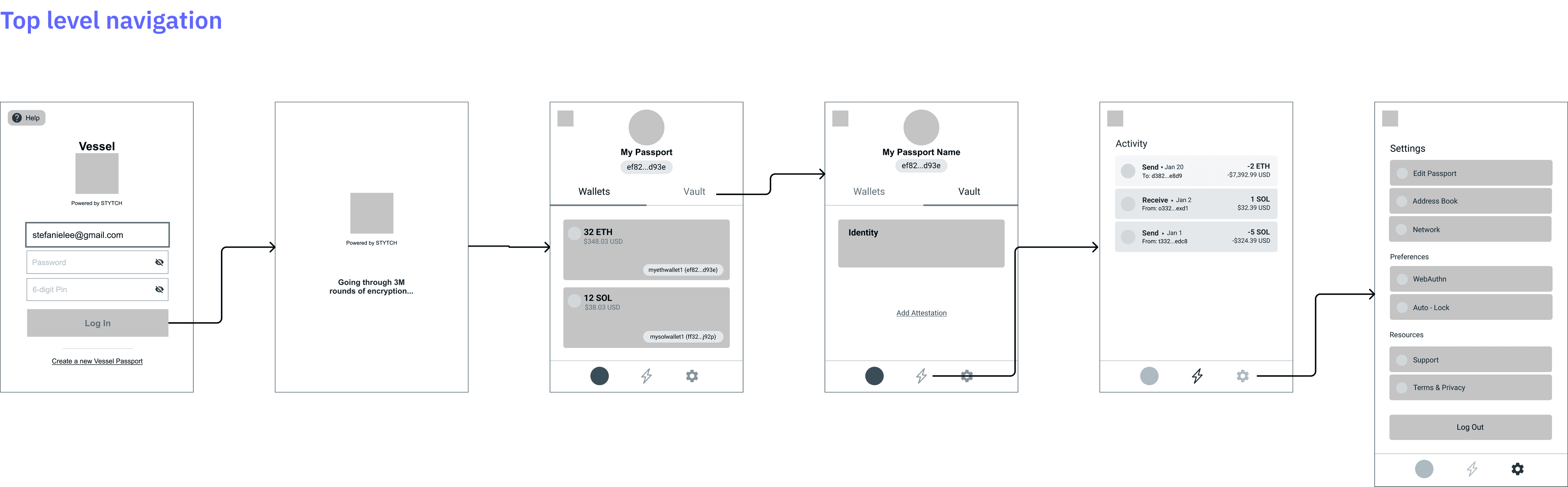
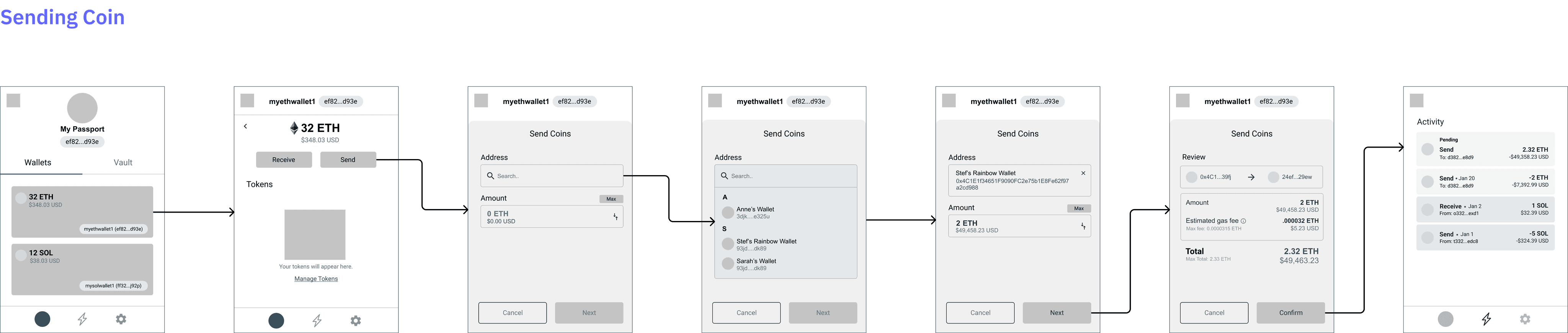
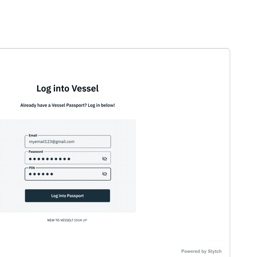
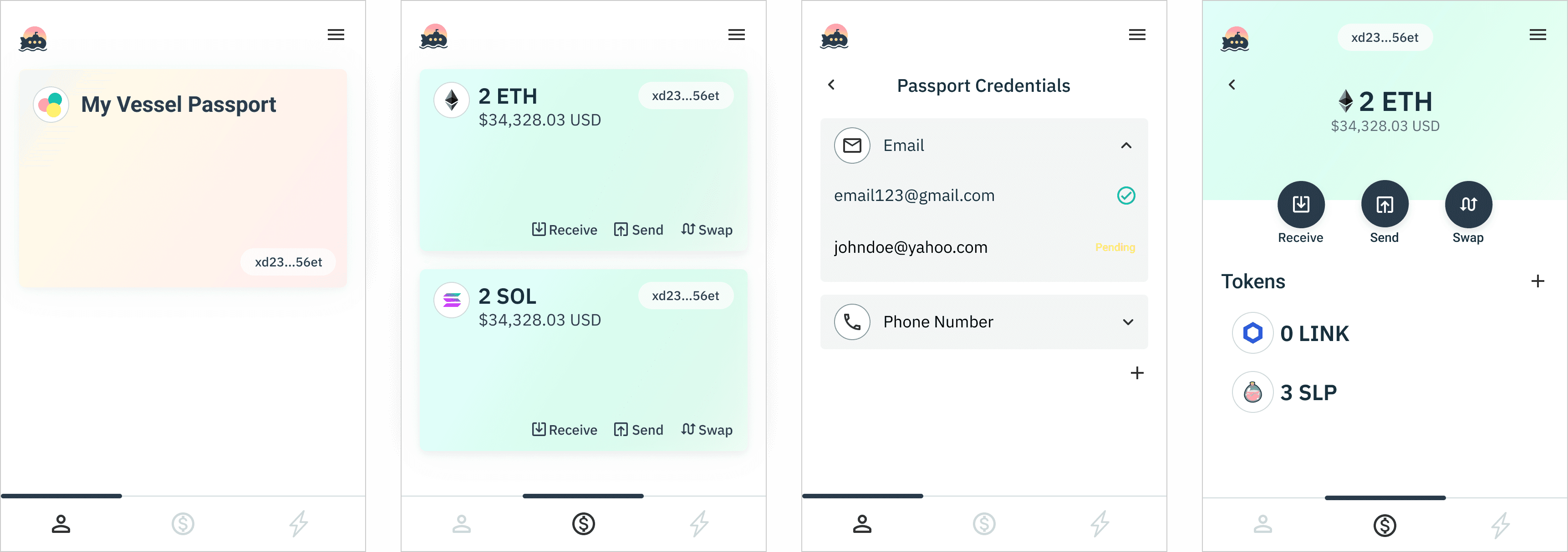
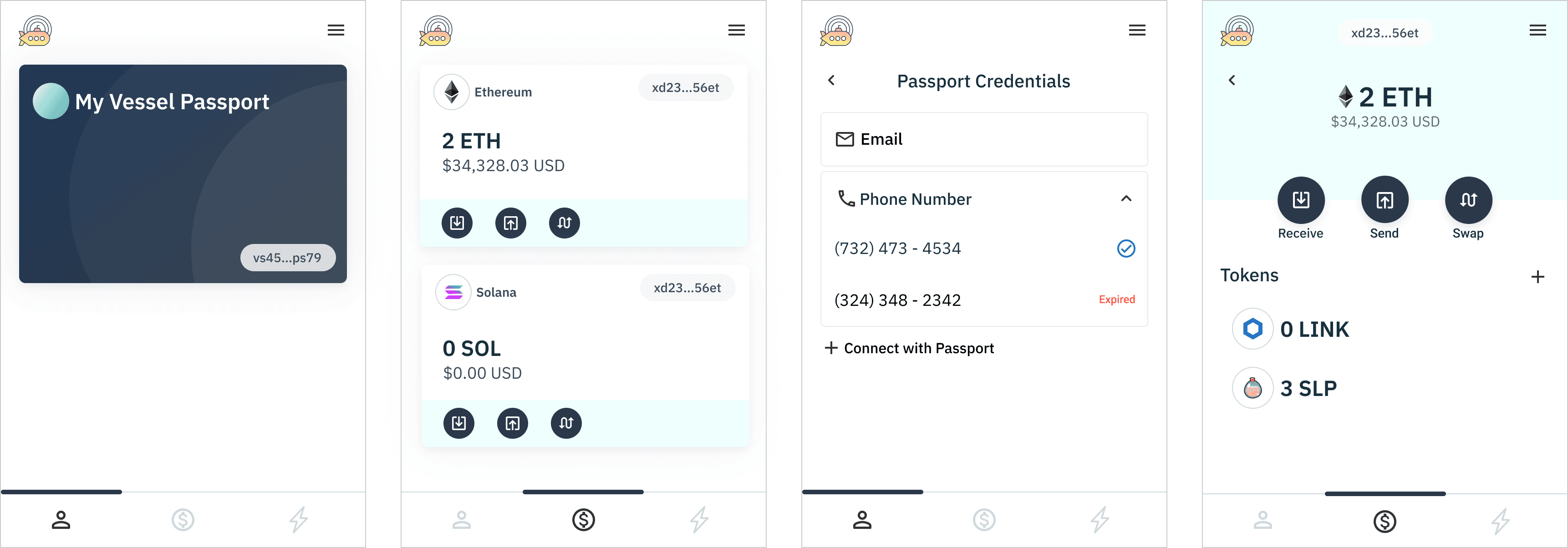
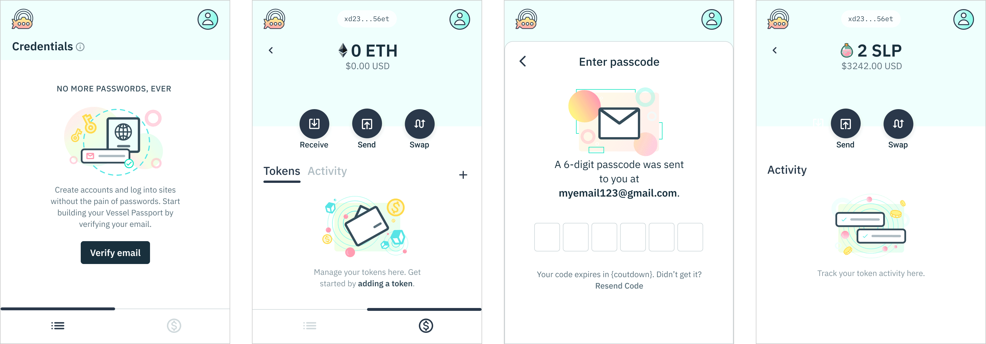
As the user requirements became more clear, I started to iterate on low fidelity wireframes to visualize these experiences, mapping out key functions such as sign up and login, crypto transactions, and editing user info.
Desktop web interfaces
See here for a closer look into an iteration.
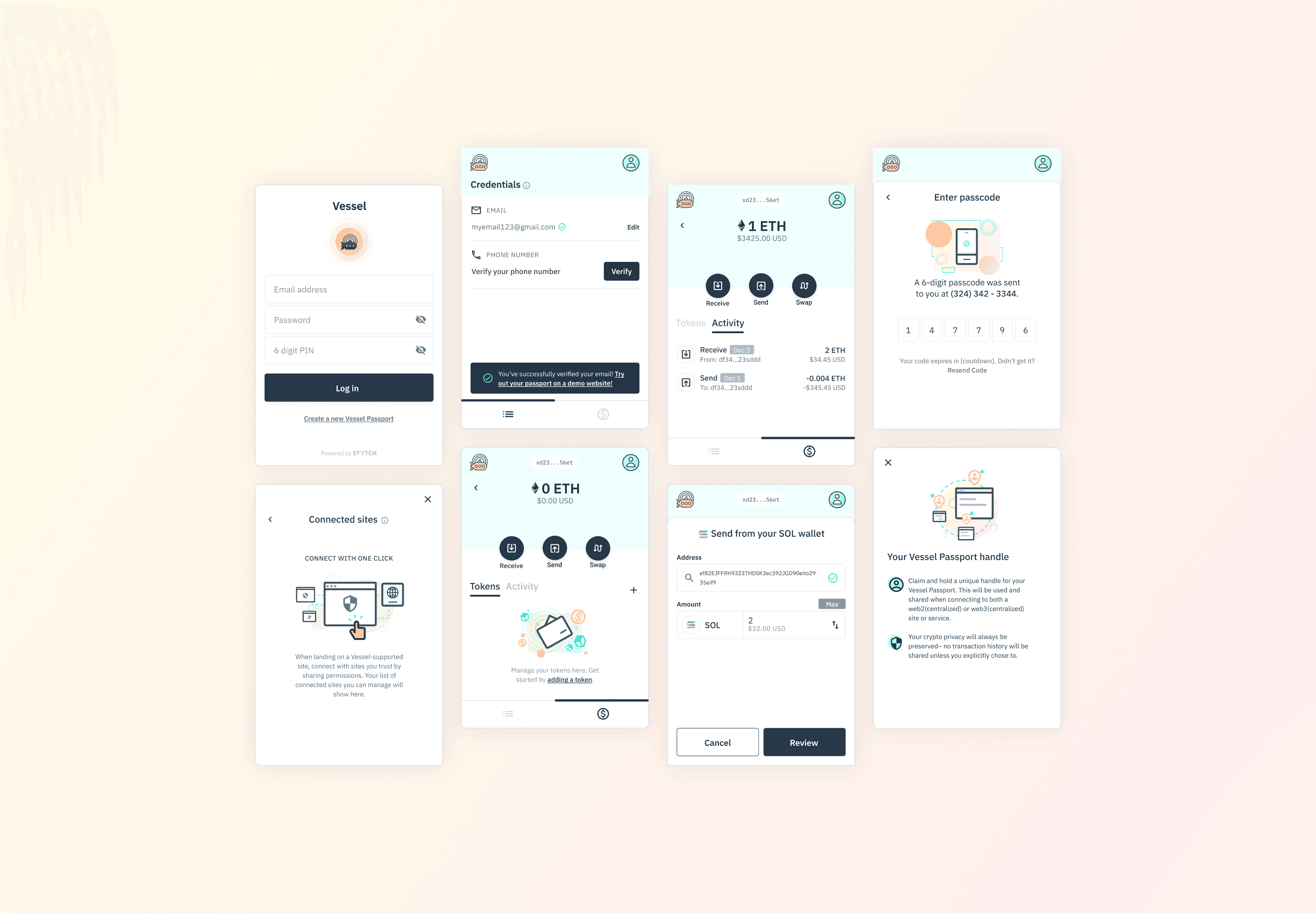
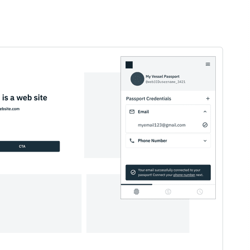
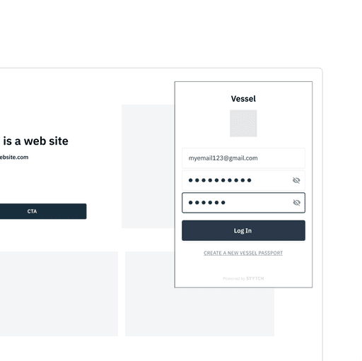
Browser extension
See here for a closer look into a few iterations.

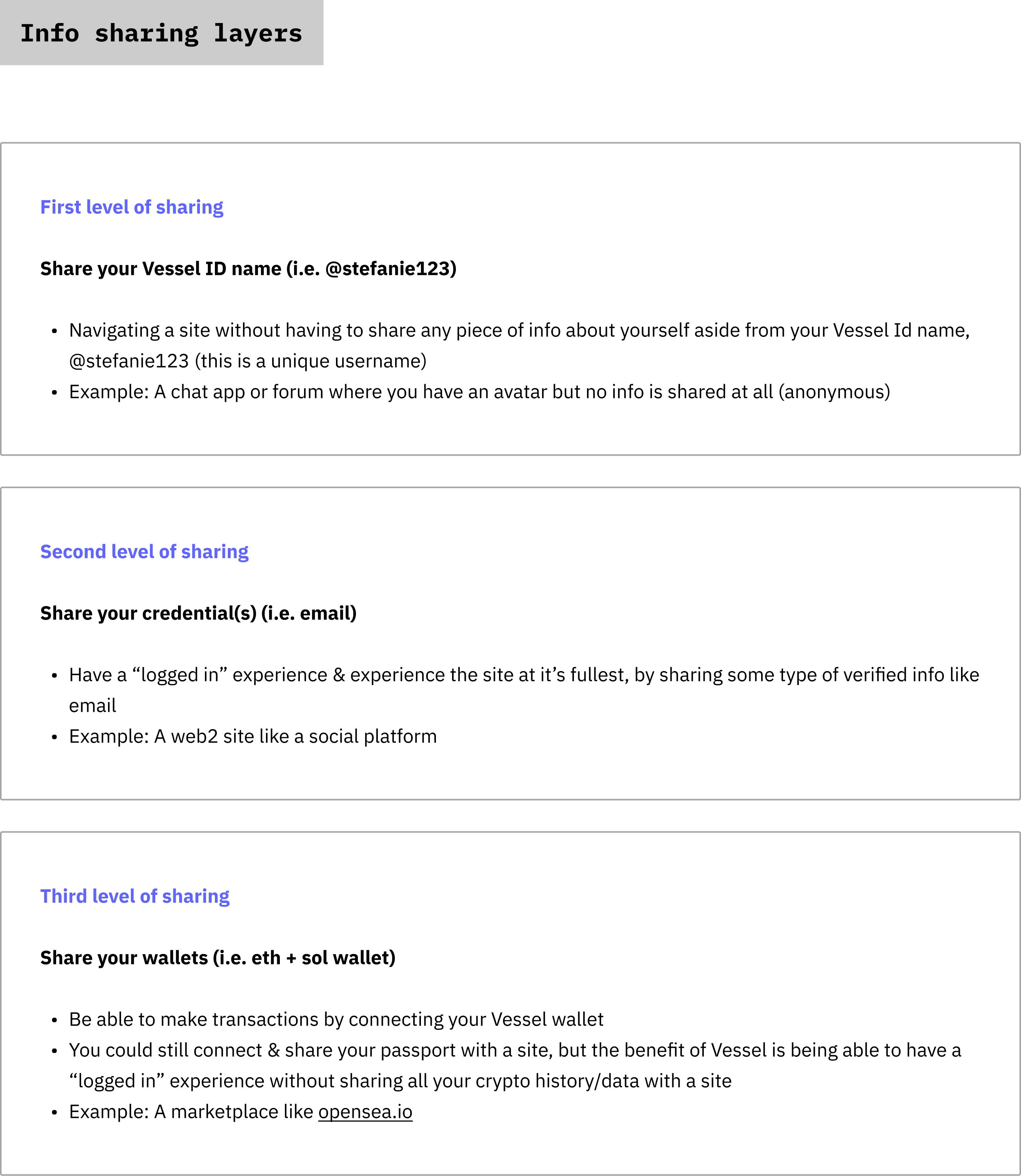
Your passport for the internet
Rapidly ideating and synthesizing feedback during the wireframing stage helped me to articulate both value props and a way to frame the product.
Users can think of Vessel as a "passport" for the internet; a key to any door on the internet.

DESIGN
Prototyping
Throughout the design process, I found it incredibly valuable to share user flows through limited prototypes. This not only helped stakeholders reach a much clearer level of understanding, but also was a way to iterate and gain feedback much faster.
Click on the images to view some limited prototype iterations.


RESEARCH
Rapid usability testing
With a product so novel, it was imperative to get some quick feedback on the overall concepts, copy, and user flows.
Leveraging the prototypes, I collaborated with the UX researcher to not only get practical feedback, but to also get more insight into the bigger questions we had.
Are we able to narrow down our user persona at this stage?
Through testing, I was able to uncover and narrow down who our target users to should be: crypto curious and new to web3 users.
This heavily influenced decision making, from language and copy, to branding and style.
How do users feel and think about Vessel so far?
Is our content framework headed in the right direction? What are the major points of confusion?
In a perfect world, design itself should give the right context for users to navigate. In the fluctuating world of web3 however, an extra focus on copy and language is a necessity.
Insights
Apart from practical feedback, I had a better definition on our target persona: crypto curious and new to web3 users. Post usability testing, I formulated more high-level questions to help push the team forward.
Based on our user persona, what kind of branding and tone would resonate? How would that relate to Stytch's ethos?
How else can we provide more education throughout the user journey, given the current state of web3?
How can we better visually demonstrate our key features in auth on the modern web?
DESIGN
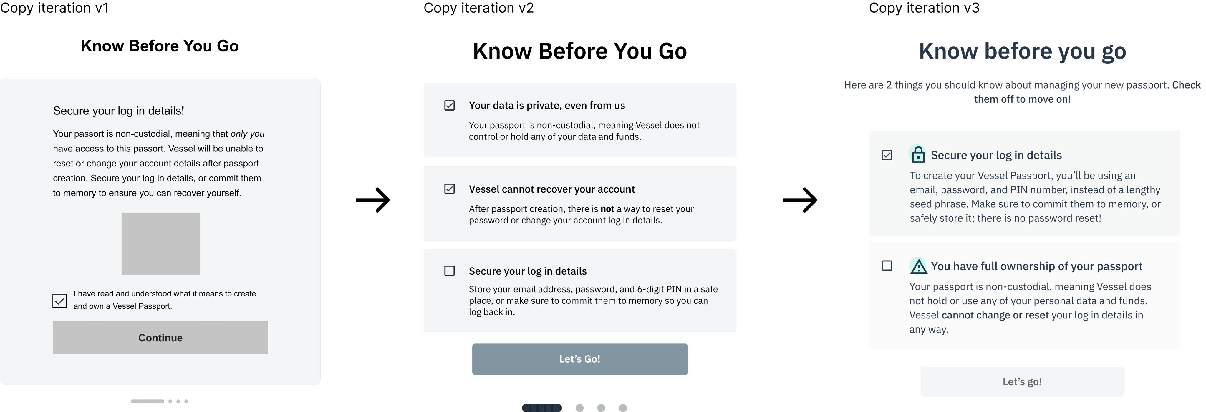
UX writing
Writing was one of the more challenging aspects for this project. A large focus throughout the design process was iterating on copy based on external and internal feedback.
Challenges mostly revolved around:
Existing web3 jargon and systems i.e. Ethereum, tokens, swapping, wallet, non-custodial wallets
Product novelty as there are Vessel-specific terms i.e. Passport, credentials, connecting or sharing your passport, connected sites
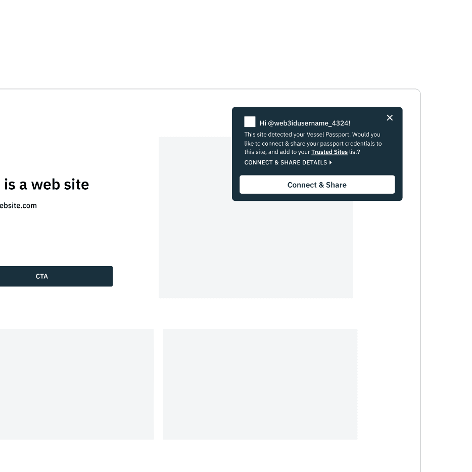
Connect passport component

Onboarding KBYG component


DESIGN
UI design
With the brand design in motion, I applied and tested various styles to the developing UI design, keeping simplicity in mind.
To ensure velocity, we stuck to a minimal UI style and leveraged some of Stytch's existing characteristics such as its typography system, button styling, and iconography.
UI testing and iteration v1
UI testing and iteration v2
UI testing and iteration v3

DESIGN
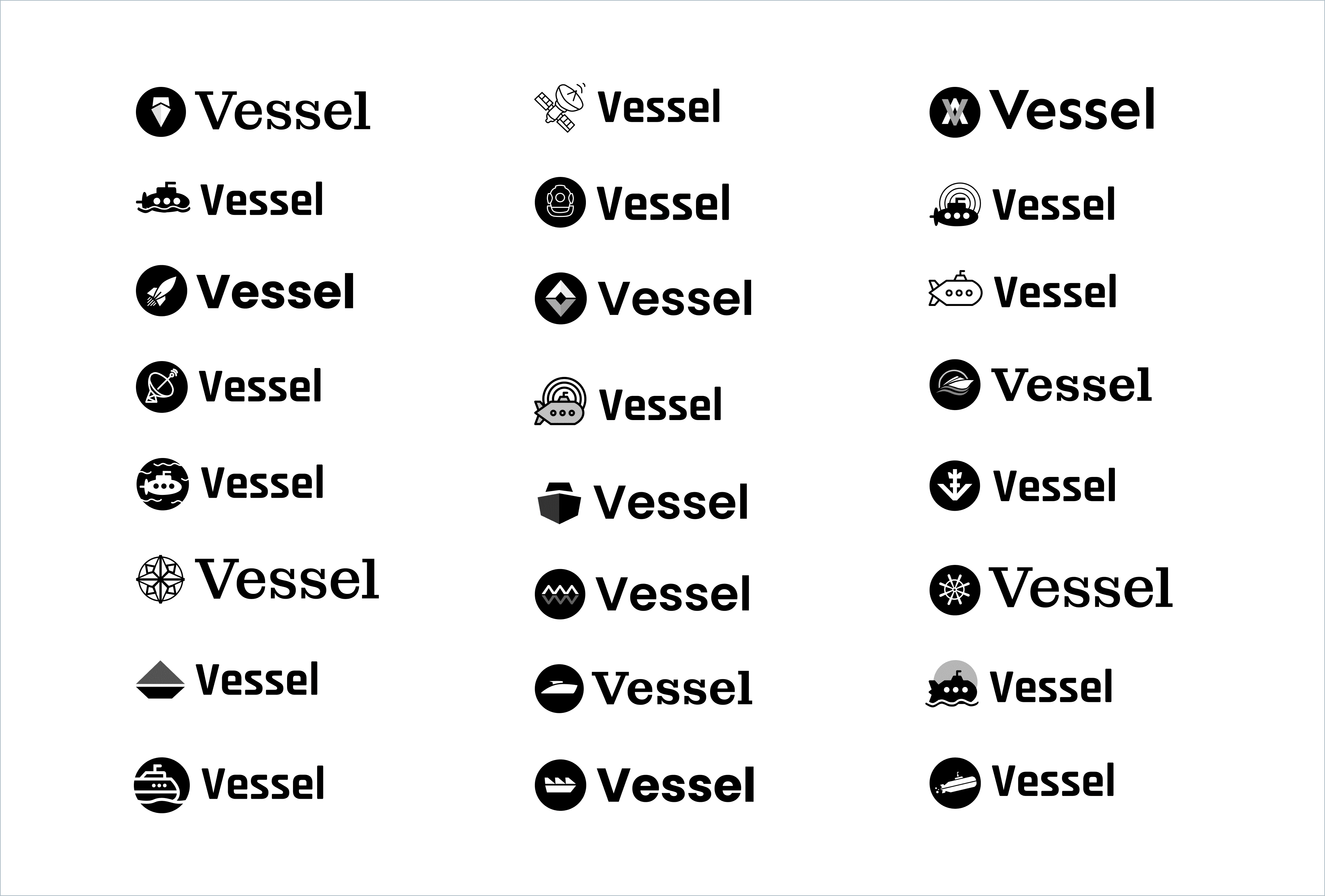
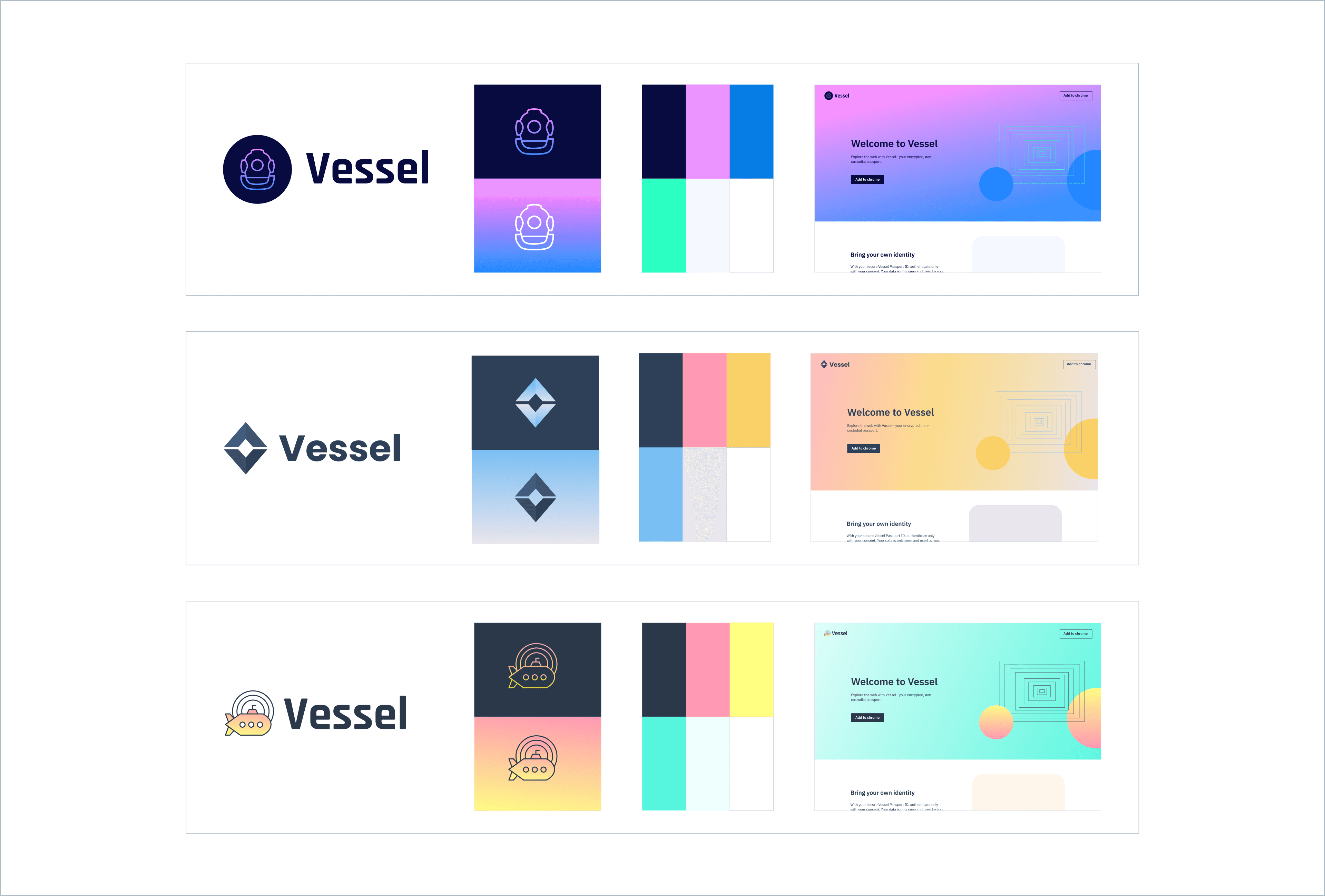
Visual design
Through Stytch's ethos and feedback from test participants, our brand strategy aimed to be quite the opposite of current web3 brand trends. Instead of dark mode and cyber-themed imagery, we wanted to exude friendly and simple, with the use of light mode.
I decided to incorporate the visionary and futuristic spirit of web3 by including themes of space and travel, but use bold colors and familiar shapes to ensure we appeal to our user persona.


DESIGN
Iteration
Progressing through the design iterations, I continued providing additional limited prototypes to support implementation.
Connect passport
Onboarding
CONCLUSION
Impact
Launching the product at Permissionless, a DeFi (decentralized finance) conference, I was able to gather feedback in person, quickly learning that:
Vessel's branding was resonating well; attendees were gravitating towards the design, specifically physical items. Should the target user persona for Vessel be web3-familiar users instead?
Attendees were most interested in the technology in which Vessel is able to eliminate the need for seed phrases. Would it be strategically beneficial if Stytch whitelisted the technology instead?
Learnings
Quickly executing end-to-end design was challenging; working with a small team, it was a balancing act to take advantage of the creative freedom, and also to make decisive and fast decisions.
Researching and understanding technical information quickly was difficult, and trying to synthesize it in a user-friendly way proved to be another testament to the importance of UX writing and copy writing in design.
I had an opportunity to do a deep dive into a new and evolving industry. Getting a chance to gather feedback and insights in person was informative to how the design discipline could fit into the larger picture.
Explore other case studies